Christo and Jeanne-Claude’s enduring en-wrap-ture

By Sarah Balcombe

The collection of the recently deceased Christo (1935-2020) and his wife Jeanne-Claude (1935-2009) featured significant artists such as Andy Warhol, Yves Klein and Keith Haring. It also provided a powerful context to their own work. This dynamic artist couple defied categorization with work which transcended borders, both literal and metaphorical. Sotheby’s has done its best to capitalize on that success by association with Unwrapped, Part 1: the Hidden World of Christo & Jeanne-Claude.

Seen alongside artists such as Lucio Fontana and Joan Miró further legitimizes their art which courted controversy and celebration, sometimes in equal measures. If there was any doubt over the extent of their contribution to modern art, last week’s auction demonstrates its significance and its longevity. Christo and Jeanne-Claude’s legacy of almost two dozen realized projects, each of extraordinary scale, is testament to the artistry, dedication and tenacity of the couple. That these were temporary installations, self-funded by sales of their own preparatory artwork, demonstrated their philosophy of accessible and inclusive art; in its truest form, art is for everyone. The value of their astonishing projects such as Wrapped Reichstag, in the mid 90s, and Surrounded Islands in Biscayne Bay, Miami, a little more than a decade earlier, is heightened by the fact that their drawings and prints are, in fact, the only remaining pieces of art of their installations.

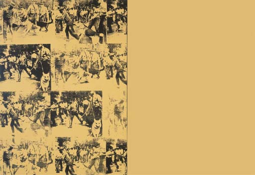
The artists were clear in their vision that the actual materials of their installations were not to be sold or hoarded, all parts were industrially recycled. So that Sothebys is essentially selling memories of projects, at a time when public art by outliers such as Banksy struggles to remain in the public domain, is particularly poignant. Comparisons will be drawn between all of these artists, especially that of Keith Haring, not only because there is documented mutual admiration, between each artist, but that Haring’s predominantly street art was essentially public. This is clever alignment in repositioning the work of Christo and Jeanne-Claude within the canon of urban life, to speak more strongly of inclusivity and representation, especially during the pandemic.

Christo WRAPPED REICHSTAG signed, partly titled, dated 1979 and variously inscribed; variously inscribed on the reverse collage with pencil, fabric, twine, pastel, crayon and ballpoint pen on card, in two parts i. 28.5 by 71.5 cm. 11 1/4 by 28 1/4 in. ii. 56.5 by 71.5 cm. 22 1/4 by 28 1/4 in.
Sold in a previous auction in February 2020 by Sothebys.

The tenacity of this artist couple is especially impressive and the scale and construction of their work begs for it to be considered as architecture, too. Wrapping the Reichstag in over a million square feet of aluminium colored polypropylene and blue rope for Wrapped Reichstag, in 1995, was 24 years in the making and required vast engineering input. This was not atypical for the projects of Christo and Jeanne-Claude. Both the time and cost of their projects was considerable. The bureaucracy, too, was on a scale which matched, if not exceeded the mammoth size of their projects. It often took decades to secure permits; administrations came and went before projects were realized. By re-imagining projects from rejected locations, sometimes decades earlier, they re-invented the notion of “site-specific” and showed versatility by pivoting and adapting. Bringing art to the people, with no possibility of ownership and allowing art to be experienced outside, in both urban and rural landscapes, demonstrates exemplary social distancing measures. Bringing people to the art is just as relevant. In 2005’s The Gates, situated in New York City’s Central Park, brought an estimated four million visitors to the city and generated an astounding $254 million, according to New York City’s, then mayor, Michael Bloomberg.

Christo and Jeanne-Claude THE GATES, 1975-2005, New York City

This couldn’t be more eagerly anticipated today, when the primary method of art engagement has had to shift. Museums and artists are having to shatter pre-conceptions as to how their collections can be experienced. It is hard to imagine that Sothebys could have picked a more apt time for this auction, when the need for inclusive art that speaks of sustainability, vision, boldness and action which has to be viewed outside, could not have been greater. That the auction was set in Paris offers another layer of escapism for many at a time when Netflix’s Emily in Paris was recently renewed for a second season. It also has classic romantic appeal and is the place where the couple first met.  Although Christo’s roots hearken back to his socialist Bulgaria, “their spiritual home” was Paris, according to Simon Shaw, the vice chairman of the fine arts division of Sotheby’s. Most significantly it also this year’s site for the anticipated realization of their 1961 project, L’Arc de Triomphe, Wrapped . Just as the works of Christo and Jeanne-Claude were and continue to be fleeting moments in a rapidly changing world, so their art collection captures and shares a snapshot of the lives of the artists and their friends. With last week’s first part of the auction tripling estimates and netting a staggering $9.8million, it appears that collectors attributed value not only to the legacy of this couple, but also to this intimate portrayal of their community.

Attracting and inspiring an outdoor audience has never been more relevant. Ditto raising the level of inquiry, debate and demonstrating social justice. As time moves on, perceptions have shifted and finally, it appears, caught up. The artists’ play with scale and interceptions in the landscape currently seem less disruptive, even more palatable following architect Rem Koolhaas’ Countryside, The Future exhibition at the Guggenheim. Enormity of scale has taken on an even broader meaning during a global pandemic when incomprehensible tolls and spatial limitations are being grappled with on a daily basis. Christo and Jeanne-Claude’s early commitment to sustainability in the form of recycling is exemplary. And even if none of the above had been applied, it is likely that presenting the sheer aesthetic beauty of their projects, especially during this time, to a general public who have been starved of travel and adventure for over a year, would have been enough.

Primarily these projects continue to encourage debate and raise awareness of beauty, of scale and of freedom.  Christo and Jeanne-Claude helped to re-write the narrative of public art half a century ago and their work continues to inspire and impress. Such is their legacy. Sotheby’s attempts to capitalize on that is hardly surprising, but with his comment to ArtNet a year ago, “I am an educated Marxist, I use the capitalist system to the very end. It’s economical, clever, and it’s stupid not to do it,” Christo, it seems, could very well be having the last laugh.

True Colors with Ron Agam

By Sarah Balcombe

Sheltering in place doesn’t seem so bad when you have a studio like Ron Agam. Shelves of iridescent day-glo pigments, large canvases with psychedelic patterns and 3-D painted panels present a colorful background. He wears his colors, too. Pink “glasses of hope” are accessorized by complementary colored beanie hats. Today it’s a slightly more restrained pale grey one, hinting at the weather this mid-April morning. Nevertheless the viewers of this virtual tour are excited. The size of some of his pieces, at “eight or nine feet” is astonishing as is an illuminated bloom, Georgia O’Keefe style, on a glossy black background. “I used to take these photos of flowers as if I was taking portraits,” he announces. From there the conversation turned inwards.     

Commissions from luxury brands such as LVMH had resulted in more commerc-ial attention, but increased stress, resulting in a health crisis. A lengthy recuperation period caused him to reassess his sense of self in relation to that of his celebrity father, Ya’akov Agam, whose art has dominated the Israeli art world for decades. Ron Agam explains, “At that time I was searching for something which would give me comfort”. He found it, recalling a memory of himself at five years old, painting alongside his father. Yet his subsequent decision to shift into painting was not taken lightly. “I never believed that I would ever be a painter.” He equates it to Einstein having a son who suddenly wants to go into physics. “And I was 52, I’m 62 today, it’s like almost a suicidal path in terms of trying to make something out of it.” 

Agam claims his influences derive from Bauhaus artist Josef Albers and the Russian Constructivist Kazimir Malevich. He lists his clients as Crown Prince Mohammed bin Salman of Saudi Arabia, Madonna and the French Ambassador, from whom he received the Chevalier of the Legion of Honor award. He uses his art to try to make peace, to unify nations through a universal art, yet also seems aware of the responsibility of ensuring that his art speaks of himself, not of his father. This is more tricky when it comes to his kinetic art as this is precisely the category which catapulted his father to international fame in Paris in the mid-fifties, alongside artists such as Alexander Calder and Jean Tinguely. 

A huge black and white patterned disc appears to spin as Agam approaches. A hologram starts to move and suddenly this feels even more contemporary. Stripes and swirls suffice, resonating with the TikTok generation and street art aficionados alike. Regarding any success generated by the Agam name, he states, “It may help me a little bit to have the name but at the end of the day you are appreciated for what you do and not for who you are.” Cutting through the styling, the color, the marketing, one very much appreciates this view into his “little universe.” He approaches his art with a sense of urgency and complete dedication, “It is never too late to do something in life. I use this gift of life, I don’t want to see it wasted.” 

His positive courage and successful pivot, is the takeaway message. Reverting to those early passions, memories of that younger self may be just what is needed to navigate a post-pandemic world. Bearing a positive message of retro re-invention, Ron Agam is primed and ready for re-entry. His art with its message of renewal, welcomes in the New Year, with its color, mysticism, light and just enough symbolism.

Author ID: Sarah Balcombe is an architect, artist and founding editor of the arts blog www.manhattanmodernist.com. Her artwork can be seen at www.sarahbalcombe.com.

Talkin’ Bout a Revolution (in Concrete)

By Sarah Balcombe

Could there be a new style of architecture, in the mix, so to speak, for concrete?

Historically, there’s nothing new about concrete. A sand and cement mixture dating back to Nabatean (Bedouin) traders was used to build the first concrete-like structures around 6500BC, using hydraulic lime as waterproofing for underground cisterns. 

cistern-nabataean-petra

Geographically this was possible due to the deposits formed by reactions between limestone and oil shale around 12 million years ago in what is now Israel. Addressing potential structural failure, the Nabateans introduced tamping using specific tools to increase the bonding gel produced by the chemical reaction which naturally occurs during hydration. 

This is key to the exciting article in last week’s New York Times, recording the creation of a new kind of concrete, by a team at University of Colorado, Boulder, which utilizes energy to create calcium carbonate.

15TB-CEMENT2-superJumbo
Wil Srubar and Sarah Williams, Ph.D. student. UNIVERSITY OF COLORADO, BOULDER,COLLEGE OF ENGINEERING & APPLIED SCIENCE

The energy is released by cyanobacteria, when sand and water are added during a photosynthesis process. Using gelatin as a catalyst assists the speed and formation of bonds, and with moulds/shuttering, a concrete block forms. Though the block is not as strong as conventional concrete, DARPA, the Defense Department research funder was extremely excited by the result, not just due to its initial bright green color and DARPA branding, with a recessed logo on its side, but because of its potential. As a “live” material the block could be cut weeks later, and with the addition of raw materials  formed new concrete, with the capacity to generate three new generations per block. This made the concrete itself reproducible, massively reducing its carbon footprint, already reduced by the carbon dioxide absorbing qualities of the cynobacteria. This material also reduces the necessity for “virgin sand” a rapidly depleting natural material required in the manufacture of conventional concrete. According to Dr Srubar, head of the research project, waste materials such as ground glass or recycled concrete could be ground into particles to mimic the sand, forming similar bonds.

 As Guy Thompson of the Concrete Centre stated in November’s Concrete Quarterly, “Innovation is an  exciting process, but it is also a lengthy and costly one.” He mentioned that the success of new materials can only be secured after years of rigorous testing and price competitiveness. Optimistically though he states “a more collaborative pan-industry approach would help us achieve our goals more quickly”. This concrete could be just the collaborative product that these teams could bring to the marketplace.

If concrete heralded Nabatean and classical civilization,  birthed modernism and whose face defined brutalism, what new architecture can we hope for with this new concrete? Certainly a more environmentally friendly, cost- effective and transformative one. Responsive to light could this generate less articulated, more organic facades which store energy efficiently,  spurning a new generation of intelligent facades?

new-57
In the facade of Institut du Monde Arabe, Paris, by Jean Nouvel, apertures respond to solar rays.

In the company of algae walls and mashribiya-like solar facades (above), could this live concrete be the material for a new critical regionalism in an age of diversity?


Warhol’s America at the Whitney

By Sarah Balcombe

“Everybody has their own America, and then they have the pieces of a fantasy America that they think is out there but they can’t see…And you live in your dream America that you’ve custom-made from art and schmaltz and emotions just as much as you live in your real one.” — Andy Warhol, America, 1985

mustard race riot

Flowers, soup cans and Brillo boxes are most commonly associated with Warhol and it is these ironic silkscreens, paintings and sculptures for which he is best known. Yet it is Warhol’s narrative of modern culture which is truly engaging and paradoxical. A product of the establishment and anti-establishment, Warhol strove to portray celebrity icons, and also those less celebrated.

With his effectual re-posting of Charles Moore’s photograph of Birmingham Alabama’s riots in Mustard Race Riot, 1963 above, his Ladies and Gentlemen series, 1975, below,

TG W

featuring trans-rights activists and his Jean-Michel Basquiat collaborations, see Paramount, 1984-5, below, Warhol acknowledged the less acknowledged, and fringe communities whilst continuing a preoccupation with capitalism and Hollywood.

IMG_5389

MLW

Although Warhol continued to use repetition as an aesthetic device and a commentary on monetary value, he introduced a further element of abstraction, as shown in his Sixty-Three White Mona Lisa’s, 1979, above, a sophisticated adaption of his earlier Thirty Are Better Than One, 1963, below, utilizing pattern and paint to obscure content.

IMG_5370

In Camouflage Last Supper 1986, below, 

LSW

Warhol similarly obscures another Leonardo da Vinci iconic painting, with the stronger fatigue pattern almost completely overwhelming the content. This obscurification can be seen as a more poignant expression of loss during the height of the AIDS crisis and shows a continuation of his fascination  with pattern, abstraction and material as demonstrated in his experimental Shadow (Diamond Dust) and Oxidation Paintings in the late 1970s. 

IMG_5403

Shadow (Diamond Dust), 1979-9, above.

Oxidation Painting, 1978, Gold, metallic, pigment and urine on linen, below.

IMG_5400

Visit Andy Warhol- From A to B and Back Again at the Whitney, before its closing on Sunday, to see another side of the artist. His work is so compelling and progressive that it bizarrely renders subsequent works by artists such as YBA’s Damien Hirst obsolete. The post-Warhol detached series of dots, butterflies, formaldehyde sharks and diamond encrusted skulls of the 1990s are a poor substitute to Warhol’s profound, yet obscured, expression of self, both in society and out of it.

‘Tis the Winter of Our Discontent

By Sarah Balcombe

Just like nothing said summer like Alex Katz at the Neuberger, nothing says winter and particularly the winter of our discontent than Charles White- A Retrospective at MOMA.

love letter charles white

With images such as Love Letter I 1971 (above) protesting the arrest of Black Panther activist Angela Davis and Birmingham Totem 1964  (below) referencing the 1963 Klu Klux Klan killing in Sixteenth St Baptist Church in Alabama, it is poignant to reflect on this year past, with so many racially motivated destructive acts carried out in places of worship across the United States.

birmingham totem

White’s detailed illustrations and images of dignity, strength and suffering provided the narrative for many African Americans, empowering a social consciousness leading up to and during the Civil Rights Movement.

sound of silence

It possible that in his later years ,White was  influenced by artists such as Barkley L Hendricks whose Icon for My Superman 1969 (below) has a similar boldness and sense of irony to White’s Sound of Silence, 1978 (above).

bh09-023-icon-for-my-man-superman-superman-never-saved-any-black-people-bobby-seale-hr-280x350

Undoubtedly White’ s work paved the way for more recent artists, such as Kehinde Wiley whose decorative Alios Itzhak (The World Stage: Israel)

wiley

shows a remarkably similar palette, to White’s commemorative Banner for Willy J, 1976 (below).

charles-white-slide-6ddk-articlelarge

During the cold snap be sure to catch the last few days of this stunning retrospective, listen to the accompanying soundtrack and podcasts by Harry Belafonte and Kerry James Marshall, then beat a hasty retreat downtown to the Whitney to check out Andy Warhol’s images of Mustard Race Riot, 1963 (below). It is no coincidence that this was the same year that Martin Luther King gave his “ I Have a Dream” speech.

A better tribute to Martin Luther King Day, I have yet to find.

mustard race riot


Summer Days Drifting Away


Nothing truly says summer like an Alex Katz exhibition and it is only fitting that “Brand New and Terrific” at the Neuberger Museum of Art at Purchase College, NY, should end as the cold snap begins. Goodbye to the casual style of slung jackets and white tennis shoes in “After Softball”, 1953 and the relaxed mode of “Lincolnville Beach”, 1956.

ballgame.jpgAfter Softball, 1953

Image result for lincolnville beach alex katzLincolnville Beach, 1956

Though this exhibition concentrates on his early work and precedes his more well-known  Blue Umbrella and crisp, bolder palettes, it confidently displays the evolution of Alex Katz’s style. And style, it seems, is everything to Katz.

Influenced by the advertising posters of the fifties and sixties, there is something iconic about Katz’s work, despite it not fitting in exactly to any genre. “I never fit in,” he told The New Yorker,  “I’m not a Pop artist, and people can’t see my work as realistic, either.” Like Warhol, Katz is fascinated by fashion and many of his paintings reflect a seemingly country club set though Katz states “Most of my paintings are of poor poets and painters. So why the perception that he paints only privilege and prosperity? He shrugs. “I record whatever’s in front of me,” he replies. “It’s the style that’s fancy” and he mentions that his fashion interest derives from memories of his immaculately dressed father.

The flatness of his work suggests a certain confidence and detachment, as well as an abstraction. Here these early works are presented as an exercise in reduction. Despite his work bridging modernism and the dominating Abstract Expressionism of the period, it can also be seen as one of the precursors of Pop Art. Indeed, in an interview Katz proclaims  ” Warhol ripped me off”. Despite Warhol focusing on everyday objects, Katz’s subjects were objectified in their detachment.

clamdiggers.jpg

By depicting two figures in Clamdiggers at Ducktrap (1956), above, and a repeated figure in Double Portrait of Rauschenberg (1959), below, Katz paid homage to choreographed composition, possibly referencing their contemporary, John Cage, who choreographed installations and dance happenings with Rauschenberg. This introduction of a repeated image is experimental in that it precedes the work of Andy Warhol and David Hockney.


Double Rauschenberg.jpg

10AM.jpg

Although Katz’s fascination with Matisse, can be seen in his collages and some of his paintings, particularly 10 AM, 1959, above,  it is hard to ignore the orangey yellow of Ives Field, 1956, below, which adds a distinctive Van Gogh palette.

Ives Field.jpg

One is reminded of Van Gogh’s letter to Emile Barnard in 1888 in which he writes, “There is no blue without yellow and without orange, and if you put in blue, then you must put in yellow, and orange too, mustn’t you?” It is also unlikely that the naming of Alex Katz’s only child, Vincent was coincidental. At a time when the work of Jackson Pollock and de Kooning defined an era, it is interesting to see not only the influence of these European artists in Katz’s work but also validation of the roots of Katz’s modernist abstract style.

Although this exhibit does not display Katz’s later more well known work, it does successfully demonstrate the early beginnings of his interest in blocks of color and composition. It also significantly introduces his wide-smiled wife and muse Ada, Bather, 1959, below, who has been the subject of more than 200 of his works.

Bather, 1959.jpg

It is the image of her in Ada (Oval) 1959, below, that gives a glimpse into the style that his future art will take. Gone are the tentative pastels. The bolder colors and lines become synonymous with Katz’s later glorious work and hint at the impact that his murals and large canvases will have and continue to have. Rooted in time and yet timeless, it is his representation of this New York easy sensibility and feminine strength that makes Katz’s work  so universally appealling and relevant.

ada oval.jpg

A Jasmine Journey

112780_7604_wide-5d58480a96d52ea67dae9368c96786c5f33d10da-s1600-c85

By Sarah Balcombe

With an east wind allegedly bringing Mary Poppins to our screens in December, Katrina Lenk’s and Tony Shalhoub’s references to a jasmine wind transporting “Omar Sharif” to their own screens, delighted audiences, on Sunday night at Radio City Music Hall. As The Band’s Visit accrued rewards at the Tonys, the viewers were themselves transported beyond the re-carpet affair to the intimacy of a circumstantial encounter. Deceptively mundane in its storyline of an Egyptian band accidentally stranded in a southern Israeli town, it is the show’s exoticism,  fragrant imagery, promise and simplicity which ultimately secured its deliverance.

This vulnerable, volatile glimpse into complex lives, renders this performance sublime and relatable. With Arabic ouds and riq cacophonies yielding to Middle Eastern melodies, one is reminded that harmony can be found in the most unlikely of sources. Whether these fragmented souls are restored to any semblance of unity, or merely relieved by an interlude to their grieving and monotony, it is unlikely that Broadway will again witness such restorative dignity, for a very long time.  And it is this rawness of human dignity, that is the engaging message of the play. As suggestive in its possibilities as Mary Poppins and La La Land, The Band’s Visit authentically lacks any formal display of coordination or choreography.  No, the charaters will not be singing on the freeway,  flying up to the stars, or jumping over chimneypots, they are rooted in their displacement. That is both their tragedy and their release.

Like a good shakshuka, these actors/ ingredients of humility combine, blaze and reduce to produce a tantalizing blend of simmering optimism, palatable for both the everyday and special oocasions. The rendition of “Omar Sharif” with its jasmine  breeze, accompanies even the most reluctant viewer on a journey of nostalgia and commonality. The Band’s Visit much-needed theme of cross-cultural inclusivity should be rewarded and it is, with 10 Tony awards celebrating Orin Wolf’s mature adaptation of such a flavorsome movie. The only regret is that Ronit Elkabetz, who was inspiring in her role of the beguiling Dina in the 2007 movie did not live to see this achievement. It will be interesting to see what her cinematic counterpart, Sasson Gabay, will make of Broadway’s stage. Providing yet another reason to revisit the show, the biggest challenge will undoubtedly be securing a ticket.

(Photo: John P. Filo/CBS) 

Will Alsop’s “Lifting the Spirit” Legacy

Image result for cardiff bay alsop

A painter, first and last, the architect Will Alsop provided a much-needed injection of humor and vitality to the somewhat staid pre-millennial architectural scene in London.  Manhattan Modernist recalls this larger than life figure, lecturing at Cambridge University’s School of Architecture, with a glass of scotch in one hand and a cigar in the other. An appropriate stance for this colorful figure whose flamboyancy extended to his cigar-shaped and geometric buildings on legs. Memorable structures include Cardiff Bay Visitor Centre, UK, 1990 (above), Marseille’s regional government headquarters, France, 1994 (below), Hamburg Ferry Terminal, Germany, 1993, and his refreshingly blue North Greenwich Tube Station, UK, 1998.

With strong modernist roots,  and a penchant for Pop Art and Archigram, Alsop’s architectural career was as dramatic and almost as chequered as his Sharp Centre for Design, at Ontario College of Art & Design, 2004, (below) his practice entering receivership, followed by rebrands  and relaunches.

Nevertheless his painterly buildings, vibrant personality and his Stirling Prize winning seminal Peckham Library, 2000, challenged conventionality, emitting optimism and confidence in an uncertain context. Will and his claim that  “lifting the spirit (..) is the job of the architect” will be missed.

(Photo Credit: Roderick Coyne. Other images are courtesy of All Design for Dezeen.)


Shaken, But Not Stirred


Image result for twa hotel martini bar

Hot on the heels of the news that Saarinen’s TWA terminal at JFK, defunct for the past 16 years, is successfully embracing its jet-set past and being transformed into a hotel complete with martini bar and that 1960s vibe, above, reports that Marcel Breuer’s Pirelli building, below, in New Haven, Connecticut, may be  similarly developed, is good news indeed. In a throw-away society, when buildings are often considered as disposable as the products by the IKEA store that owns the Breuer building, it is refreshing to see that there is a growing movement towards adaptable re-use of our modernist heritage.

Marcel Breuer’s legacy is still evident in this part of Connecticut with  surviving homes such as Donald N. Clarke House in Orange and  628 West Rd in New Canaan, that was actually Marcel Breuer’s own home. His non-residential, less-local buildings include UNESCO’s headquarters in Paris and Atlanta Central Library (1980) GeorgiaWhilst Breuer’s most well-know building is probably the granite-clad striking Manhattan’s Met Breuer, below, (originally the Whitney Museum, completed in 1966), the fact that he was teaching at Harvard and one of the members of the Harvard Five, asserts his rightful place in architectural history.

A muscular concrete stack amidst the stately homes of Manhattan’s Upper East Side, the Whitney imposes itself on the neighborhood, an architectural statement as challenging as the work housed inside. The granite exterior, ascending edges and upside-down windows, initially seen as pushy and gauche, are now recognized as inspired and grandiose.  Photo 10 of 12 in Design Icon: 10 Buildings by Marcel Breuer
IMG_8621[2].JPG


whitney-12.jpg

Ironically, Breuer may be better remembered as the teacher of Philip Johnson, whose Glass House, below, brought European modernism to the US , heralding the introduction of the International Style architecture to the Connecticut residential vernacular.

cdnassets.hw

Despite the  inspiration for the Glass House, above, being credited to Mies Van der Rohe’s Farnsworth House, Johnson’s iconic home is rapidly approaching its 70 year anniversary and is still considered one of the finest examples of  modern architecture, with its innovative use of glass and steel and its integration into the landscape. Though it has the privileged distinction of being designated a National Historic Landmark in 1997 and is now owned by the National Trust for Historic Preservation, many of Breuer’s buildings lack that protection. Let us hope that his Pirelli building will avoid demolition by joining the ranks of these other modernist masterpieces, recognised for their architectural integrity, ingenuity and for some, adaptability.

(Photo credits From top: David Mitchell, via Quartzy, Max Touhey, Mackenzie Goldberg, Patrick Sisson, Sarah Balcombe, Sarah Balcombe,  Blaine Brownell)